When you count "one, two, three..." what's actually happening in your head? Does your best friend use that same mental model? Now what about an LLM?
(What's that you say, your best friend is an LLM? Pardon me for assuming!)
Let Me Count the Ways to Count
During grad school Feynman went through an obsessive counting phase. At first, he was curious whether he could count in his head at a steady rate. He was especially interested to see whether his head counting rate varied, and if so, what variables affected the rate. Disproving a crackpot psych paper was at least part of the motivation here.
Unfortunately Feynman's head counting rate was steady, and he got bored. But the counting obsession lingered. So he moved on to experiments with head counting and multitasking. Could he fold laundry and count? Could he count in his head while also counting out his socks? What about reading and writing, could they be combined with head counting?
Feynman discovered he could count & read at the same time, but he couldn't count & talk at the same time. His fellow grad student Tukey was skeptical because for him, it was the opposite. Tukey could count & talk, but couldn't count & read.
When they compared notes, it turned out Feynman counted in his head by hearing a voice say the numbers. So the voice interfered with Feynman talking. Tukey, on the other hand, counted in his head by watching a ticker tape of numbers go past. (Boy this seems useful for inventing the FFT!) But Tukey's visualization interfered with his reading.

Even for a simple thing like counting, these two humans had developed very different mental models. If you surveyed all humans, I'd expect to find a huge variety of mental models in the mix. But they all generate the same output in the end ("one, two, three...").
This got me wondering. Do LLMs have a mental model for counting? Does it resemble Feynman's or Tukey's, or is it some totally alien third thing?
If an LLM has a non-alien mental model of counting, is it acquired by training on stories like this one, where Feynman makes his mental model for counting explicit? Or is it extrapolated from all the "one, two, three..." examples we've generated in the training data, and winds up as some kind of messy, non-mechanistically-interpretable NN machinery ("alien")?
Potemkin Understanding in LLMs
I'm not convinced present-day LLMs even have a "mental model." But let's look at a new preprint with something to say on the matter, Potemkin Understanding in LLMs.
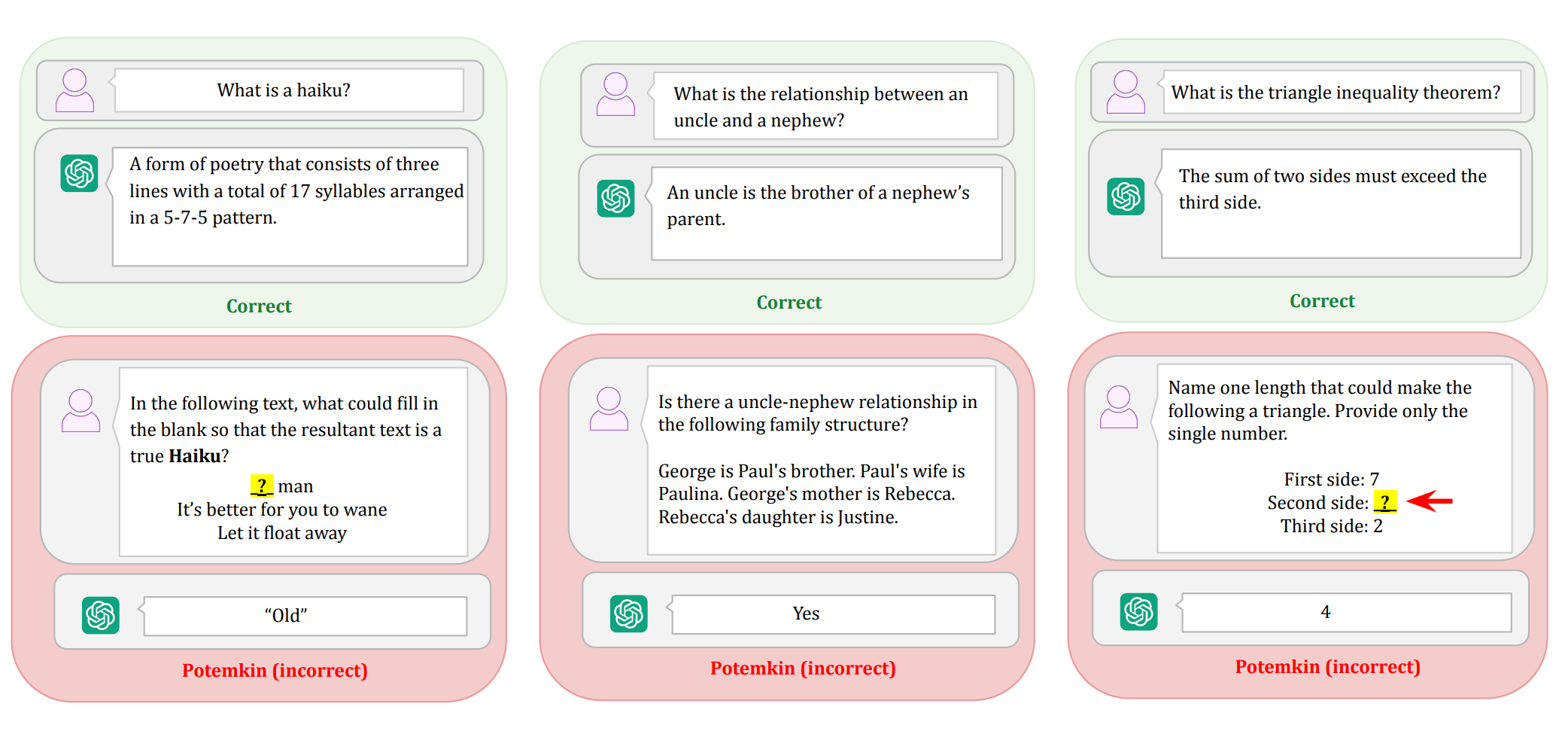
In this paper, the authors ask an LLM a high-level conceptual question like "define a haiku." As we've come to expect, the LLM coughs up the correct 5-7-5 answer. Then they ask it some follow-up questions to test its understanding. These follow-up questions deal with concrete examples and fall into three categories:
- Classify: "Is the following a haiku?"
- Generate: "Provide an example of a haiku about friendship that uses the word “shield”."
- Edit: "What could replace the blank in the following poem to make it a haiku?"
The LLM fails these follow-up questions 40% - 80% of the time. These Potemkin rates are surprisingly high. They suggest the LLM only appeared to understand the concept of a haiku. The paper calls this phenomenon Potemkin Understanding.
Now when you ask a human to define a haiku, and they cough up the correct 5-7-5 answer, it's very likely they'll get the concrete follow-up questions right. So you can probably skip them. Standardized tests exploit this fact and, for brevity, will ask a single question that can only be correctly answered by a human who fully understands the concept.
The paper authors call this a Keystone Question. Unfortunately, the keystone property breaks down with LLMs. They can correctly answer the conceptual question, but fail to apply it, showing they never fully understood it in the first place.
Apparently LLMs are wired very differently from us. So differently that we should probably stop publishing misleading LLM benchmarks on tests full of Human Keystone Questions ("OMG ChatGPT aced the ACT / LSAT / MCAT!"), and starting coming up with LLM Keystone Questions. Or, maybe we should discard this keystone question approach entirely, and instead benchmark on huge synthetic datasets of concrete examples that do, by sheer number of examples worked, demonstrate understanding.
I like this paper because it bodychecks the AI hype, but still leaves many doors open. Maybe we could lower the Potemkin rate during training and force these unruly pupils of ours to finally understand the concepts, instead of cramming for the test. And if we managed that, maybe we'd get brand new mental models to marvel at. Some might even be worth borrowing for our own thinking.